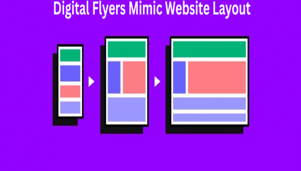
Should digital flyers mimic website layout?
Maintaining Visual Consistency
- Using similar layout elements strengthens brand recognition.
- Shared color schemes, fonts, and icons reinforce identity.
- Helps users transition smoothly between flyer and website.
- Reduces confusion when interacting with multiple assets.
- Builds trust through familiar visual structure.
Adjusting for Medium Differences
- Flyers are static and size-limited, unlike scrollable web pages.
- Layouts should be simplified for quick viewing.
- Key messages must be prioritized due to space constraints.
- Avoid replicating navigation menus or long content sections.
- Focus on clear call-to-action and summary visuals.
Enhancing User Experience
- Alignment with website layout improves user flow.
- Encourages action by mirroring familiar online behavior.
- QR codes or links should match the digital flyer’s tone.
- Similar placement of contact or product info supports usability.
- Reinforces continuity across marketing channels.
Balancing Creativity with Structure
- Flyer design allows for more focused and bold messaging.
- Website layouts are more content-dense and modular.
- Flyers benefit from high-impact headlines and visuals.
- Use website design cues without copying full structure.
- Maintain creative flexibility for different campaign goals.
Optimizing for Conversion
- Consistent design drives higher response rates.
- Users clicking from digital flyers expect matching landing pages.
- Reinforcing layout structure improves retention of brand offers.
- Helps guide users naturally to the next step.
- Prevents disconnect between flyer message and online journey.


