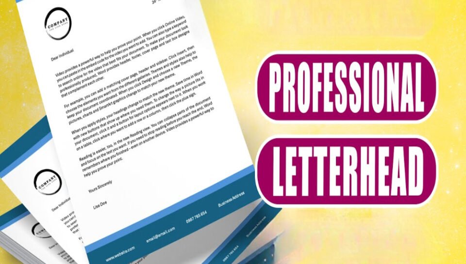
What design mistakes should be avoided in professional letterheads?
Overcrowding of Information
- Avoid placing too much text or contact data in limited space.
- Refrain from listing unnecessary details or repeated content.
- Ensure sufficient white space around elements for readability.
- Prevent overlapping of address blocks, logos, or footers.
- Excessive information makes the layout cluttered and unprofessional.
Inconsistent Branding Elements
- Do not use unapproved logo versions or altered brand colors.
- Avoid mismatched fonts or inconsistent font sizes across elements.
- Ensure all graphics follow official brand design standards.
- Inconsistencies weaken corporate identity and recognition.
- Branding must remain uniform across all printed and digital formats.
Poor Quality Graphics and Printing
- Never use pixelated or low-resolution images and logos.
- Avoid designs that rely heavily on complex gradients or shadows.
- Ensure all visual assets are optimized for both print and digital use.
- Overuse of colors can result in faded or inconsistent print output.
- Quality issues reflect poorly on organizational professionalism.
Improper Alignment and Margins
- Do not misalign text, logos, or section breaks.
- Maintain balanced and symmetrical margins throughout the page.
- Avoid placing key content too close to the edge of the page.
- Misalignment distracts the reader and disrupts visual flow.
- Consistent spacing reinforces structure and legibility.
Non-Standard Paper and Format Usage
- Avoid using unconventional paper sizes for official documents.
- Stick to standard A4 or approved formats for uniformity.
- Do not apply background images that interfere with text.
- Ensure compatibility with commonly used printers and software.
- Irregular formats may be rejected in professional or legal settings.


