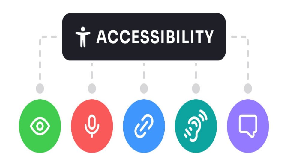
What are key accessibility elements in package design?
Readable Typography and Labeling
- Font sizes are large enough for easy reading across age groups.
- Clear, sans-serif fonts improve legibility under varied lighting.
- High contrast between text and background ensures visibility.
- Text is not placed over complex graphics or gradients.
- Important information is printed in bold or outlined sections.
Tactile and Sensory Cues
- Raised lettering or Braille assists visually impaired users.
- Embossed or debossed patterns help differentiate product types.
- Textures signal handling points like open zones or safety areas.
- Distinct material surfaces indicate caution, orientation, or tamper points.
- Tactile indicators can be used for batch or category distinction.
Easy-Open Mechanisms
- Tear notches, perforated lines, and peel-back tabs reduce opening effort.
- Flip lids, magnetic closures, or slide-out drawers are preferred over glued flaps.
- Design avoids excessive reliance on fine motor skills.
- Resealable features support convenience for limited dexterity.
- Visual cues guide how to open or interact with the package.
Visual Icons and Instructional Graphics
- Simple, universally recognizable icons indicate use, storage, or disposal.
- Step-by-step illustrations support users with literacy challenges.
- Color coding helps identify product types or usage stages.
- Directional arrows and cues assist in product orientation.
- Consistent placement of symbols improves intuitive recognition.
Inclusive Language and Information Layout
- Messaging avoids jargon and uses concise, action-based language.
- Important details like dosage, ingredients, or usage steps are grouped clearly.
- Multilingual labels accommodate regional and diverse user bases.
- Instructions are broken into short, visually separated segments.
- Layout design respects left-to-right or right-to-left reading where applicable.


