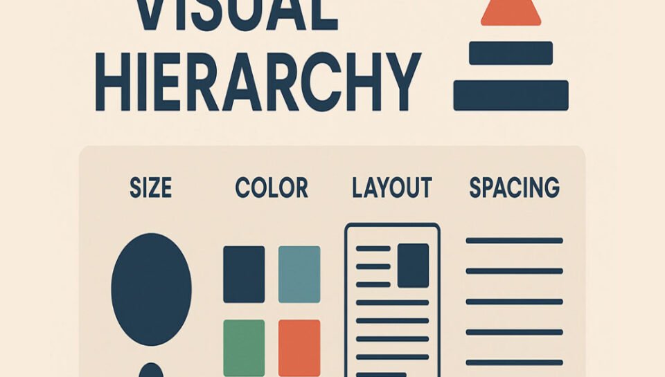
Establish the role of visual hierarchy in package design.
INTRODUCTION
Visual hierarchy is a fundamental design principle that guides how viewers process and prioritize information. In package design, visual hierarchy is crucial—it determines what the consumer sees first, what they remember, and ultimately, whether they engage with or purchase a product. By directing attention to the most important elements in a logical and aesthetically pleasing way, visual hierarchy enhances clarity, usability, and impact. This article establishes the key role that visual hierarchy plays in effective package design and how it shapes consumer perception and behavior.
1. DIRECTS CONSUMER ATTENTION
In a competitive retail or digital environment, packages have only a few seconds to capture attention. Visual hierarchy ensures that key elements—like the brand name, product name, or key benefits—are seen first. Size, boldness, contrast, and placement work together to guide the consumer’s eye in a purposeful order.
2. COMMUNICATES KEY INFORMATION QUICKLY
Consumers often scan rather than read. A well-structured hierarchy presents essential information—such as product type, features, or ingredients—in a clear, digestible manner. Headings, subheadings, bullet points, and callouts help organize content so that it can be understood at a glance.
3. ENHANCES READABILITY AND USABILITY
By differentiating font sizes, weights, and colors, visual hierarchy improves text readability. When a package contains multiple layers of content—branding, nutritional info, usage instructions—hierarchical design prevents visual clutter and makes navigation intuitive, even on smaller packaging formats.
4. SUPPORTS BRAND IDENTITY
The prominence and placement of brand elements (like logos and taglines) reinforce identity and recognition. A strong hierarchy ensures that the brand voice is not lost amid other content. It allows the design to stay true to the brand while still accommodating regulatory or functional details.
5. CREATES AESTHETIC BALANCE
Hierarchy contributes to the overall visual balance and harmony of the design. It prevents designs from appearing chaotic or disorganized by creating a rhythm between text, imagery, icons, and empty space. Balanced layouts are more appealing and perceived as more professional and trustworthy.
6. DRIVES PURCHASING DECISIONS
Clear, compelling hierarchy can influence buying behavior by highlighting value propositions such as “Organic,” “Low Sugar,” “New Formula,” or “30% Off.” These callouts, when given visual priority, communicate benefits effectively and motivate consumer action.
7. ACCOMMODATES MULTIPLE AUDIENCES
Some packages need to address different audiences—retailers, end consumers, and regulators. Hierarchy allows designers to present layered information without overwhelming the user. For example, the front may highlight marketing messages, while the back includes technical or legal details.
8. ADAPTS TO VARIOUS PACKAGING FORMATS
Different formats (boxes, pouches, bottles, cans) pose unique challenges. Visual hierarchy helps adapt design across sizes and shapes while ensuring content remains organized and impactful. This is especially important for mobile shopping thumbnails or small-format packaging.
9. ENHANCES DIGITAL INTERACTIONS
In e-commerce, where customers can’t physically interact with products, visual hierarchy becomes even more important. Product listings rely on clean, hierarchical layouts to communicate features and benefits in zoomed or thumbnail views. This ensures a seamless translation of packaging from physical to digital space.
10. STRENGTHENS MEMORY RETENTION
Effective visual hierarchy not only attracts attention but also enhances recall. By strategically emphasizing key visuals and messages, it makes products more memorable—supporting repeat purchases and building brand loyalty over time.
CONCLUSION
Visual hierarchy is the backbone of effective package design. It transforms content into a structured, engaging, and persuasive layout that communicates quickly and clearly. From the supermarket shelf to the online product page, a strong visual hierarchy ensures that the right message reaches the right audience at the right time—ultimately driving recognition, trust, and sales.
HASHTAGS
#VisualHierarchy #PackageDesign #DesignPrinciples #PackagingStrategy #ConsumerEngagement #PackagingLayout #BrandVisibility #TypographyInDesign #DesignForShelf #PackagingTips #RetailPackaging #MarketingDesign #UserFriendlyDesign #InformationDesign #HierarchyInDesign #ProductLabeling #CreativePackaging #PackagingPsychology #PackagingMatters #DesignToSell #DesignHierarchy #DesignImpact #EcommercePackaging #PackagingSuccess #BrandDesign


