

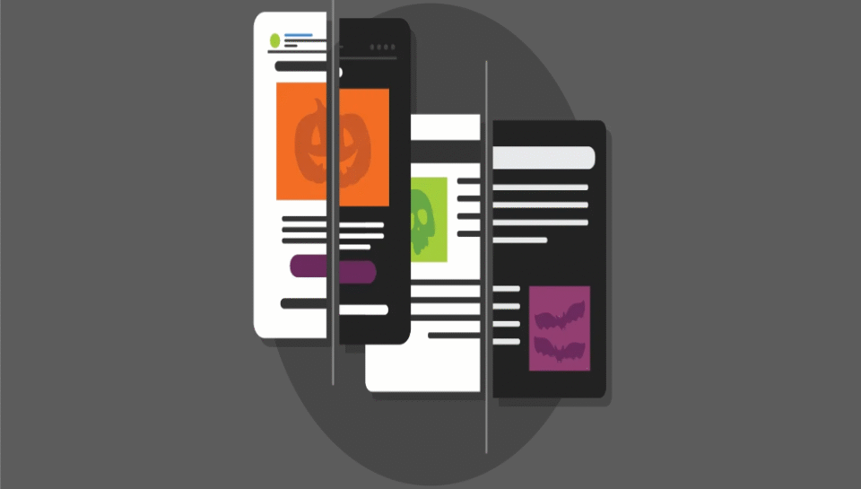
How does dark mode affect branding design decisions?
1. Visual Hierarchy and Readability
Dark mode changes the visual weight and contrast of UI elements, making certain design components stand out more or fade into the background. Branding in dark mode must account for legibility and clear hierarchy without relying on default white backgrounds.
- Use high-contrast, light-colored text (e.g., white or soft gray) for readability
- Avoid using pure black as a background; opt for deep charcoal or navy tones
- Adjust font weights and sizes to retain visual clarity in darker interfaces
- Ensure key branding elements like headings and CTAs remain prominent
- Maintain adequate spacing to prevent visual clutter in low-light layouts
2. Brand Color Adaptation and Tone
Colors appear differently against dark backgrounds—brighter, more saturated, or sometimes even distorted. Brand palettes must be adjusted for optimal visibility and psychological impact in dark mode.
- Choose lighter or tinted variants of brand colors for primary buttons and icons
- Avoid overly vibrant hues that may cause eye strain on dark surfaces
- Use complementary light tones to preserve brand identity without visual fatigue
- Ensure brand colors maintain accessibility compliance (minimum contrast ratios)
- Test gradients and overlays specifically for dark mode rendering
3. Logo and Icon Optimization
Logos and icons often need separate versions for dark and light backgrounds. A single-format logo may lose visibility or aesthetic appeal when rendered against dark UIs.
- Create inverted or monochrome versions of the logo optimized for dark mode
- Add subtle glows or outlines to improve contrast against dark interfaces
- Avoid transparent PNGs with dark shadows that may blend into the background
- Test icons with various stroke weights to ensure clarity and recognizability
- Align icon styling across mobile apps, web platforms, and presentations
4. Emotional and Brand Personality Shift
Dark mode gives a sleek, modern, and sometimes more “serious” tone to a brand. Depending on the industry and audience, this can either enhance or diminish the brand’s perceived personality.
- Use dark mode to signal sophistication, innovation, or premium positioning
- Evaluate if dark mode aligns with your brand’s tone (e.g., fintech, AI, cybersecurity)
- Balance mood and tone with accent colors or animation to retain friendliness
- Understand that younger, tech-savvy users may prefer dark mode for usability
- Align dark mode usage with the overall emotional goals of your digital branding
5. Multi-Platform Brand Consistency
Dark mode branding must remain consistent across web, mobile apps, dashboards, and documents. This requires adaptable design systems and flexible components.
- Create dark-mode variants in design systems (e.g., buttons, cards, nav bars)
- Use the same grid and layout rules as light mode for predictable behavior
- Apply brand rules uniformly in developer handoffs and front-end frameworks
- Ensure visual branding looks cohesive whether in dark email themes, presentations, or websites
- Provide brand guidelines with specific dark mode usage rules for internal teams