Describe methods to ensure accessibility in letterhead design.
INTRODUCTION
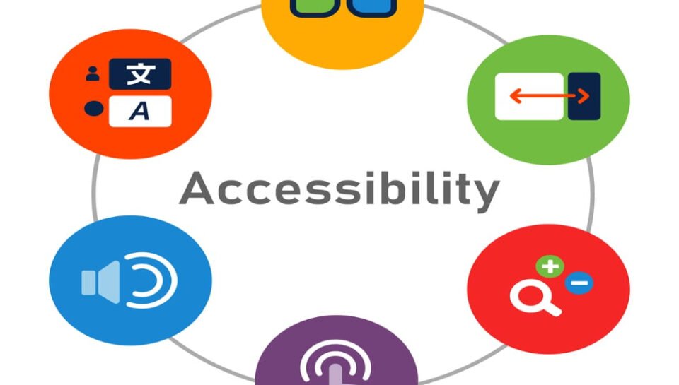
Accessibility in design refers to creating products and visuals that are usable by as many people as possible, including those with disabilities. In letterhead design, accessibility ensures that the layout, text, colors, and visual elements are readable, understandable, and functional across diverse audiences. Whether the letterhead is used digitally or in print, inclusive design practices contribute to better communication, legal compliance, and brand credibility. Below are key methods to ensure accessibility in letterhead design.
USE HIGH CONTRAST COLORS
Maintaining sufficient contrast between text and background is essential for users with low vision or color blindness. Black text on a white background offers the highest readability, but other combinations can work if they meet WCAG (Web Content Accessibility Guidelines) contrast ratios. Avoid using light gray text or placing text over busy backgrounds that make it difficult to read.
SELECT LEGIBLE FONT STYLES AND SIZES
Accessibility begins with typography. Use clear, sans-serif fonts such as Arial, Calibri, or Verdana for body text, as these are easier to read. Avoid overly decorative fonts that may confuse readers with dyslexia or visual impairments. A minimum of 11-point font size for printed materials and 12–14 points for digital formats helps ensure readability for all users.
PROVIDE SUFFICIENT LINE SPACING AND WHITE SPACE
Proper line spacing improves legibility by preventing lines from appearing cramped. A line height of at least 1.5x the font size is ideal for paragraph text. Additionally, generous white space around blocks of text, logos, and contact information prevents visual clutter and allows the eye to focus on content more easily.
STRUCTURE INFORMATION HIERARCHICALLY
Organize letterhead content using visual hierarchy—placing important elements like the logo, company name, and contact information in predictable locations. Use headings, bold text, or different sizes to differentiate between sections. This helps users, especially those using screen readers or with cognitive impairments, navigate the content more efficiently.
AVOID RELIANCE ON COLOR ALONE
Do not use color as the only means of conveying information. For example, instead of using red text to highlight urgency, pair it with bold formatting or an icon. This ensures that users who cannot distinguish colors still receive the intended message.
DESIGN FOR SCREEN READERS
If the letterhead is to be used digitally (PDF or Word), ensure that it is compatible with screen readers. This includes properly tagging headings, ensuring correct reading order, and including alternative text for logos or images. Avoid embedding text in images, as this cannot be read by assistive technology.
INCLUDE ALT TEXT FOR IMAGES
For any logos, seals, or graphic elements used in a digital letterhead, provide descriptive alt text. This allows users who rely on screen readers to understand what the image represents, supporting clarity and context in communication.
USE ACCESSIBLE FILE FORMATS
Export digital letterheads in accessible formats such as tagged PDFs or properly formatted Word documents. Avoid flattened or image-only PDFs that cannot be navigated by screen readers. Ensure documents retain their structure and do not lose functionality when opened across various platforms.
TEST WITH ACCESSIBILITY TOOLS
Use accessibility checkers like Adobe Acrobat’s Accessibility Checker or Microsoft Word’s built-in tools to review the letterhead design for potential issues. These tools highlight areas that may fail to meet accessibility standards, helping designers fix them proactively.
CONSIDER LANGUAGE SIMPLICITY
Clear and simple language benefits everyone, particularly users with cognitive disabilities or those who speak English as a second language. Avoid jargon or overly complex sentences in standard letterhead text such as disclaimers, contact information, or document footers.
HASHTAGS
#AccessibleDesign #InclusiveDesign #LetterheadAccessibility #DesignForAll #LegibleTypography #HighContrastDesign #ReadableText #UniversalDesign #AccessibleBranding #VisualAccessibility #ScreenReaderFriendly #AccessiblePDF #SimpleLanguage #DesignInclusion #AccessibleFonts #ColorBlindFriendly #DocumentDesign #WCAGCompliant #DesignForDisability #WhiteSpaceMatters #DigitalInclusion #AccessibleCommunication #LetterheadDesignTips #AccessibleTypography #EquityInDesign


