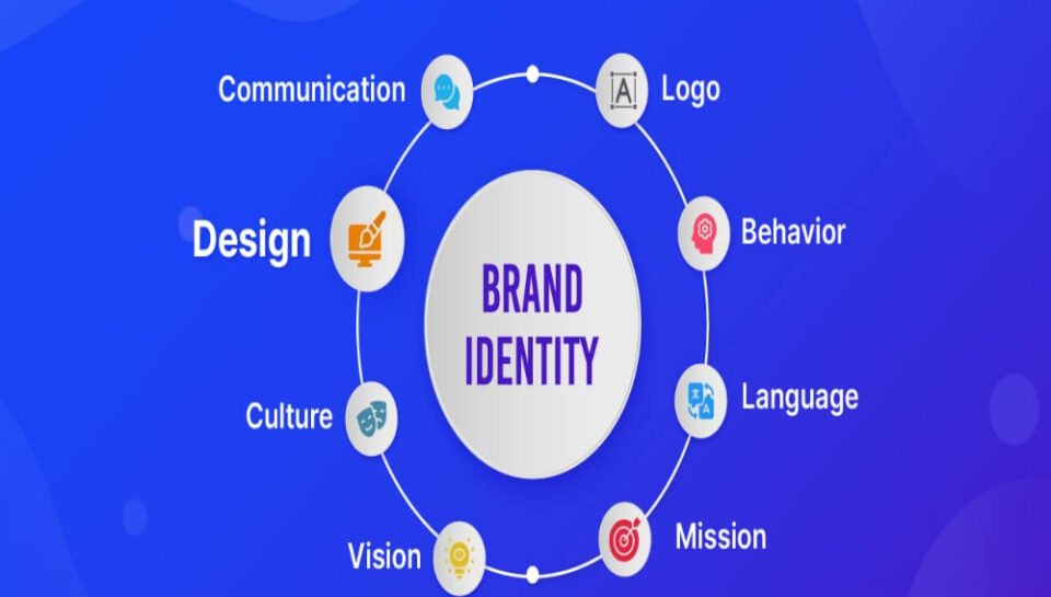
Detail the process of aligning letterhead design with brand identity.
INTRODUCTION
A well-designed letterhead is more than a header—it’s a vital extension of a brand’s identity. Every piece of official correspondence, whether printed or digital, carries the potential to reinforce how an organization is perceived. Aligning letterhead design with brand identity ensures consistency, enhances recognition, and communicates professionalism. This process requires thoughtful integration of visual and strategic branding elements into a cohesive, polished format. Below is a step-by-step guide to creating letterhead designs that are both functional and brand-aligned.
1. REVIEW THE BRAND GUIDELINES
Start by thoroughly understanding the brand’s visual identity. Review the official brand book or style guide, which typically outlines logo usage, color palettes, typography, spacing, and tone. This ensures the letterhead will align with existing branding across all touchpoints.
2. POSITION THE LOGO CONSISTENTLY
Place the logo in a location that maintains visual hierarchy and balance—commonly the top left, center, or top right corner. Maintain clear space around the logo to preserve legibility and respect brand proportions. The logo should never be distorted, pixelated, or altered from its official form.
3. USE OFFICIAL BRAND COLORS
Incorporate primary and secondary brand colors as accents in borders, header lines, footers, or section dividers. Be mindful of contrast to ensure readability. Consistent use of color builds visual recognition and helps tie the letterhead to other brand materials.
4. APPLY APPROVED TYPOGRAPHY
Select fonts specified in the brand guide. Use consistent styles for headings, body text, and footer details. Typography should reflect the brand’s personality—professional and clean for corporate identities, or more expressive for creative brands—while remaining legible across formats.
5. INCLUDE ESSENTIAL BRAND INFORMATION
Add key business identifiers such as:
- Company name and logo
- Tagline (if applicable)
- Contact details (address, phone, email, website)
- Registration numbers or certifications
Ensure this information is laid out clearly and proportionately, usually in the footer or header.
6. DESIGN FOR DIGITAL AND PRINT USE
Make sure the letterhead is responsive across media. Create separate files for high-resolution print (CMYK, 300 DPI) and digital use (RGB, 72 DPI). The design should remain sharp and professional whether printed or emailed as a PDF.
7. MAINTAIN A BALANCED LAYOUT
Avoid clutter by using appropriate margins, whitespace, and spacing. Keep the content area clear so letters can be composed easily without interfering with branding elements. A clean layout contributes to readability and aesthetic appeal.
8. INCORPORATE BRAND VISUALS OR ELEMENTS
Add subtle graphical elements from the brand—such as icons, background textures, or watermarks—that reinforce identity without overpowering the content. These should be used tastefully to enhance the design.
9. TEST ACROSS DOCUMENT TYPES
Test the letterhead with different types of content—long letters, memos, legal documents, or proposals—to ensure it adapts well. It should function smoothly across various templates and align properly in both Microsoft Word and PDF formats.
10. COLLECT FEEDBACK AND REFINE
Share the draft with internal teams for feedback, including branding, marketing, and admin staff who will use it. Refine the design based on usability and visual consistency. Finalize versions for use in different departments if needed.
CONCLUSION
Aligning letterhead design with brand identity ensures every piece of correspondence reflects the organization’s values and visual style. Through consistent use of logo, color, typography, and layout, the letterhead becomes a professional signature—instantly recognizable and reliably on-brand. A well-aligned letterhead enhances trust, reinforces credibility, and elevates corporate communication.
HASHTAGS
#LetterheadDesign #BrandIdentity #CorporateBranding #VisualConsistency #BusinessStationery #ProfessionalDesign #BrandAlignment #TypographyDesign #LogoPlacement #DesignStandards #CompanyIdentity #BrandStyleGuide #StationeryDesign #DesignTips #DigitalLetterhead #PrintDesign #DocumentBranding #CorporateCommunication #DesignWorkflow #OfficeStationery #BrandExperience #LetterheadLayout #DesignWithPurpose #CreativeBranding #BusinessDesignStrategy


