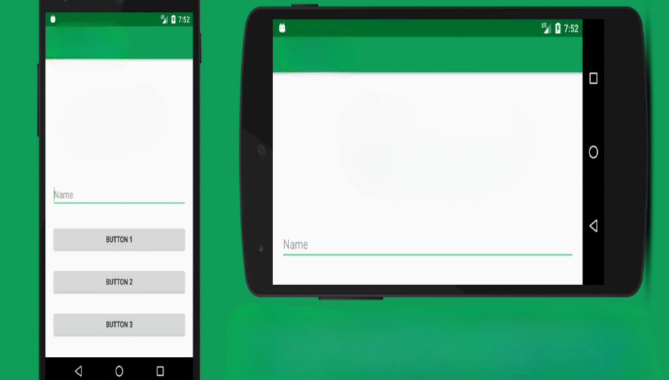
How do media graphics adapt to landscape vs portrait modes?
Aspect Ratio and Layout Adjustments
- Landscape mode uses a 16:9 ratio, while portrait uses 9:16.
- Visual hierarchy is restructured to fit vertical or horizontal flow.
- Key content is centered in portrait but balanced across width in landscape.
- Margins and safe zones are adjusted to prevent cropping.
- Text and logos are scaled to maintain prominence in both formats.
Content Framing and Focal Areas
- Portrait designs prioritize top-to-bottom storytelling for mobile viewing.
- Landscape mode allows for wider framing and background context.
- Visual weight shifts depending on screen orientation and reading pattern.
- Characters or products are framed more tightly in portrait mode.
- Focal elements are repositioned to remain visible in both layouts.
Typography and Text Placement
- In portrait, text is stacked and centrally aligned for legibility.
- In landscape, text is often placed in lower thirds or side sections.
- Font size and spacing are optimized for the respective screen width.
- Line breaks and wrapping are adapted to avoid crowding.
- Visual rhythm changes to suit the pacing of vertical or horizontal reading.
Graphic Asset Resizing and Orientation
- Icons, illustrations, and overlays are scaled differently for each mode.
- Horizontal assets may be rotated or restructured for vertical formats.
- Backgrounds are cropped or blurred to maintain focus on the main subject.
- Elements like arrows, frames, and borders are resized for readability.
- Decorative accents are removed or repositioned to reduce clutter.
Platform and Device Responsiveness
- Media is rendered differently for web, mobile, and tablet views.
- Orientation-based previews are tested across devices before publishing.
- Platforms prioritize portrait for reels and stories, landscape for players and embeds.
- Responsive design tools enable dynamic scaling across orientations.
- Thumbnails and preview frames are adapted to fit both screen types.


