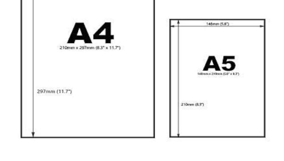
How do you maintain design uniformity across A4 and A5 formats?
Consistent Layout Structure
- Maintain the same header and footer zones across both sizes.
- Use proportional spacing to retain alignment and hierarchy.
- Design grids are scaled to match corresponding margins.
- Essential elements like logos and signatures remain in the same relative position.
- Ensure content flow and layout blocks follow a mirrored structure.
Scalable Typography and Elements
- Use scalable font sizes adjusted proportionally between A4 and A5.
- Headings, subheadings, and body text maintain consistent font families.
- Visual elements like icons and lines are resized without altering proportions.
- Vector graphics are preferred to maintain sharpness on both formats.
- Padding and line spacing are recalibrated, not eliminated.
Color and Branding Consistency
- Corporate colors are used identically across all paper sizes.
- Backgrounds, borders, and text colors follow the same brand palette.
- Avoid introducing new shades or gradients specific to one size.
- Maintain uniform color tone regardless of format or printer.
- Brand-approved color codes ensure matching output on all media.
Optimized Use of White Space
- White space is adjusted but never compromised on A5 layouts.
- Margins are resized to preserve breathing space and balance.
- Content density is moderated to suit the smaller format.
- Avoid overcrowding text or reducing font size excessively.
- Section spacing is scaled to maintain clarity and flow.
Template-Based Standardization
- Use master templates with shared design variables for both sizes.
- Elements are anchored using design tools for responsive scaling.
- Defined templates ensure uniform headers, footers, and alignments.
- Updates are applied centrally across both formats to avoid mismatch.
- Final versions are tested in print to confirm uniformity and alignment.

