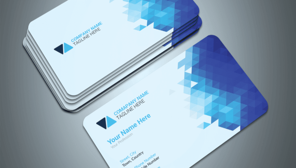
How is branding preserved on small card space?
Use of Compact Brand Elements
- Logos are scaled to fit without losing clarity.
- Brand marks or monograms are used when full logos are too large.
- Taglines are excluded or minimized in small font if essential.
- Visual hierarchy ensures logo remains the focal point.
- Simplified versions of the brand symbol are preferred.
Consistent Color Palette
- Primary brand colors are used for backgrounds or accents.
- Text and border colors follow brand color guidelines.
- Contrast is optimized to keep readability intact.
- Avoidance of non-brand colors maintains brand identity.
- Gradients or patterns are only used if they reflect official themes.
Typography and Font Standards
- Official brand fonts are used consistently across all cards.
- Font size is adjusted to fit space while retaining legibility.
- Bold weights are applied to headings like names and roles.
- Avoidance of decorative or non-brand typefaces.
- Alignment and spacing follow brand typographic rules.
Logo Placement and Layout Structure
- Logo is placed in a fixed position such as top-left or center.
- Layout is structured to create a visual balance around the logo.
- Other elements like photos or text are arranged to avoid overlap.
- White space is preserved around the logo for clarity.
- Logos are never stretched, distorted, or cropped.
Minimalist Design Approach
- Unnecessary elements are removed to free up space.
- Visual clutter is avoided to emphasize core brand identity.
- Information is prioritized to reduce crowding.
- Card is treated as a functional yet brand-driven medium.
- The design is reviewed to ensure clarity and consistency.


