How is indoor signage styled for IT coworking spaces?
Minimalist and Functional Aesthetic
- Clean lines, neutral tones, and modern typefaces dominate the design.
- Visual simplicity supports focus and avoids visual clutter.
- Signs often feature sans-serif fonts and geometric layout structures.
- Icons are used in place of text for intuitive navigation.
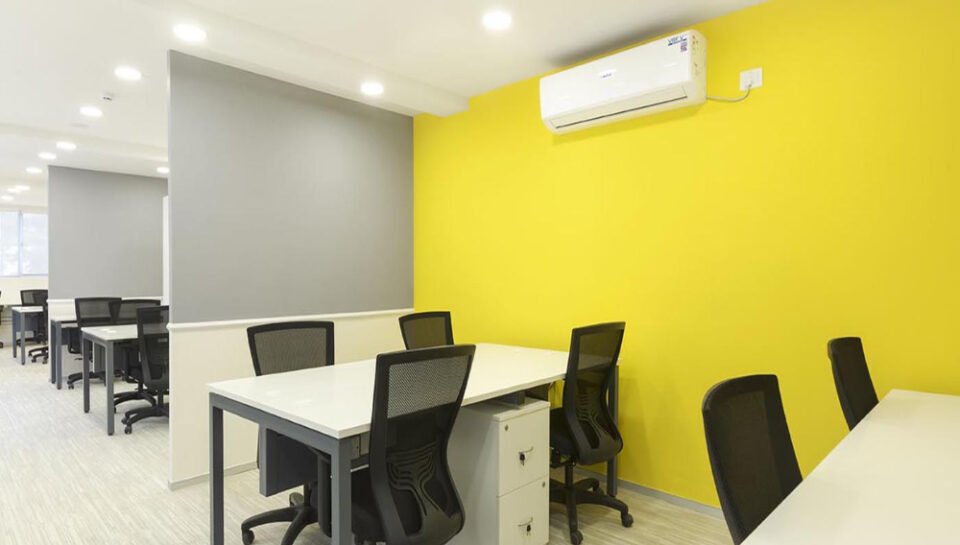
- Design blends with open-plan architecture and modular interiors.
Consistent Branding and Color Coding
- Brand colors are subtly integrated into directional and informational signs.
- Color schemes may also define zones such as meeting rooms, lounges, or hot desks.
- Signage reflects the coworking space’s identity without overwhelming it.
- Monochrome or dual-tone palettes are common for a tech-forward feel.
- Accent colors are used strategically to highlight key messages or areas.
Wayfinding and Zone Identification
- Floor graphics, suspended signs, and wall-mounted panels guide movement.
- Zones like “Quiet Area,” “Phone Booth,” or “Collab Zone” are clearly marked.
- Signage flow supports both new visitors and daily users.
- Directional cues are placed at decision points such as corridors and elevators.
- Smart layering of signs ensures clarity without repetition.
Tech-Friendly Visual Elements
- Digital display screens may be used for dynamic or updated content.
- QR codes link to floor plans, schedules, or booking systems.
- Motion sensor integration can activate signage as users pass by.
- LED-lit signage enhances readability and modern appeal.
- Icons reflect a digital culture with flat or outline-style illustrations.
Positive and Inclusive Tone
- Signs include welcoming language and motivational messages.
- Community guidelines and rules are phrased in an approachable tone.
- Typography and layout support accessibility and legibility.
- Multilingual signs are used in spaces with diverse user groups.
- Inclusivity and clarity are prioritized over corporate formality.


