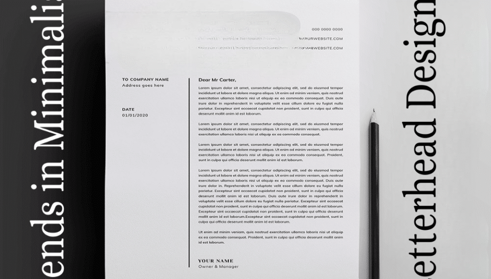
Introduce trends in minimalist letterhead designs.
INTRODUCTION
Minimalism in design is the art of stripping away the non-essential to highlight what truly matters. In letterhead design, this philosophy translates into layouts that are clean, functional, and elegant—offering visual clarity and a professional tone. As businesses and creatives embrace modern branding strategies, minimalist letterhead designs are becoming increasingly popular. These designs focus on simplicity, space, and subtle sophistication. This article explores the latest trends shaping minimalist letterhead designs and how they contribute to effective corporate communication.
CLEAN TYPOGRAPHY AS THE FOCAL POINT
Minimalist letterheads rely heavily on typography. Sans-serif fonts like Helvetica, Avenir, or Open Sans are favored for their clean lines and modern appeal. Designers are opting for bold name headers in larger font sizes paired with smaller, readable body text. Consistent type hierarchy ensures clarity and structure without visual clutter.
MONOCHROMATIC COLOR SCHEMES
Monochrome palettes—especially black, white, and gray—are trending in minimalist letterhead design. These tones emphasize professionalism while allowing key elements like the logo or signature to stand out. Occasionally, a subtle brand color is used sparingly for a touch of personality without overpowering the layout.
ASYMMETRICAL LAYOUTS FOR VISUAL INTEREST
While minimalism leans toward simplicity, asymmetrical layouts add a modern twist. By placing elements like the logo or contact details off-center or at the bottom corner, designers create visual intrigue while maintaining balance. This layout style breaks monotony and offers a fresh aesthetic without overwhelming the reader.
PLENTIFUL WHITE SPACE
White space—or negative space—is a cornerstone of minimalist design. Modern letterheads incorporate generous spacing between elements to promote readability and elegance. The use of white space draws attention to the core message and allows the design to “breathe.”
SMALL, ICONIC LOGO USAGE
Instead of large, detailed logos, minimalist designs favor small, simplified brand marks. These are often placed subtly at the top or bottom of the page. The reduced size maintains focus on the content while reinforcing brand identity in an understated way.
NO BORDERS OR GRAPHIC ELEMENTS
Gone are the days of heavy borders, watermarks, or decorative lines. Minimalist letterheads favor clean edges and blank margins. The absence of graphic embellishments ensures the design looks timeless and adaptable across various platforms and formats.
VERTICAL AND LEFT-ALIGNED CONTENT
A noticeable trend is the use of vertically stacked or left-aligned elements for addresses, contact info, and company names. This structure is both functional and stylistically consistent with modern digital and print practices, aligning with how readers typically scan documents.
DIGITAL-FIRST DESIGN CONSIDERATIONS
With the rise of remote work and digital communication, minimalist letterheads are increasingly designed with screen readability in mind. Lightweight file formats, responsive layouts, and screen-friendly fonts are now standard. Designs must look equally sharp on monitors, tablets, and mobile devices.
USE OF SUBTLE BRAND ELEMENTS
Instead of overt branding, designers now incorporate faint patterns, initials, or icons derived from the logo into the letterhead background. These are often semi-transparent and serve as subtle reminders of brand identity while maintaining a clean overall aesthetic.
MODULAR DESIGN FOR ADAPTABILITY
Letterheads are being designed as modular templates that can be easily customized for different departments, languages, or regions. This flexibility ensures consistent branding while accommodating functional diversity, all within a minimalist framework.
HASHTAGS
#MinimalistDesign #LetterheadTrends #ModernLetterhead #TypographyDesign #CleanLayout #MonochromeDesign #ElegantStationery #ProfessionalBranding #WhiteSpaceMatters #DigitalFirstDesign #SimpleIsSmart #MinimalistBranding #FlatDesign #ContemporaryDesign #AsymmetricalLayout #ResponsiveStationery #DesignWithPurpose #SubtleBranding #ModularTemplates #VisualClarity #MinimalistGraphics #CorporateIdentity #TrendyLetterhead #DesignSimplicity #MinimalismInDesign


