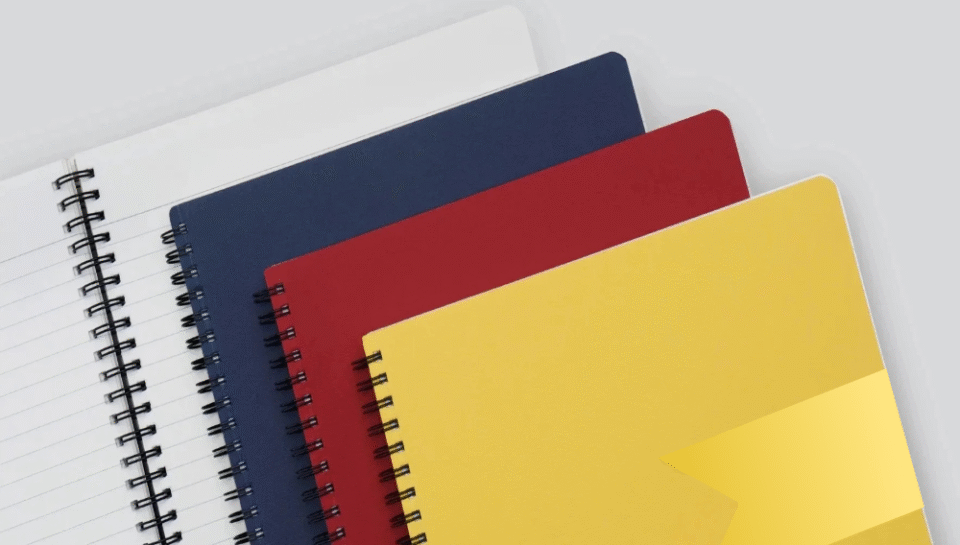
What are design norms for executive stationery (folders, notepads)?
1. Minimalist and Professional Aesthetic
Executive stationery is expected to reflect sophistication, clarity, and brand authority. The design language must be clean and restrained, avoiding overly decorative or trend-heavy styles.
- Use monochrome or neutral color palettes (navy, black, charcoal, white, beige)
- Keep layouts minimal, with ample white space and precise alignment
- Include only essential information—company name, logo, designation, and contact (if required)
- Avoid clipart or ornamental borders; prefer subtle line work or embossing
- Apply matte or satin finishes for understated elegance
2. Subtle Branding and Typography
Branding should be present but not dominant. Executive stationery uses subtle cues to reinforce identity without overwhelming the functional purpose of the item.
- Place logos in discreet positions—top left, bottom right, or center-aligned depending on format
- Use small-to-medium logo sizes with soft contrast against the background
- Stick to one or two brand fonts with consistent sizing and weight hierarchy
- Avoid bold or large typographic treatments unless part of the brand standard
- Use grey or muted ink instead of high-contrast black for internal headers or titles
3. Standardized and Practical Sizes
Executive stationery follows common size conventions that align with office use, client meetings, and document compatibility.
- Folders: A4 size (9″ x 12″) with interior slits for business cards or inserts
- Notepads: A5 or A4 size depending on purpose (compact vs. desk-based use)
- Letterheads: Always A4, aligned with formal communication standards
- Sticky notes or cards: 3″ x 3″ or 3″ x 5″, customized for minimal notes or labels
4. Premium Material and Finish Choices
Material quality defines perception. Executive stationery is expected to feel substantial and well-made, even when the design is minimal.
- Use 300–400 GSM textured card stock for folders and covers
- Choose natural or ivory-toned paper over pure white for notepads
- Consider linen, leatherette, or soft-touch laminate for covers
- Apply spot UV, embossing, or foil stamping sparingly for logo accents
- Avoid glossy finishes that reflect light or feel mass-produced
5. Functional Layout and Writing Space
For items like notepads and folders, usability is key. Designs should not obstruct writing areas or practical function.
- Include light grey or dotted ruling for writing guides without overpowering ink
- Leave wide margins to accommodate annotations or scribbles
- Avoid watermark-style logos across the writing area; keep branding to headers or footers
- Folder interiors should be clean, with a non-glossy finish for grip and durability
- Add subtle calendar grids or task lists only if aligned with executive workflow


