What spacing is ideal between lines in banner design?
Standard Line Spacing Ratio
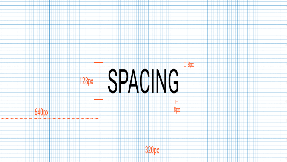
- The ideal line spacing (leading) is typically 120% to 140% of the font size.
- For example, with 40 pt text, spacing would range between 48 to 56 pt.
- This ratio ensures legibility from a distance without overcrowding.
- Too tight spacing reduces clarity, especially on large format banners.
- Too much spacing breaks the visual flow and weakens message impact.
Adjustments Based on Font Style
- Tall or narrow fonts may require slightly wider spacing for readability.
- Bold or heavy fonts benefit from tighter leading to maintain density.
- Decorative or uppercase fonts often need extra spacing to avoid visual tension.
- Font-specific testing ensures optimal balance between form and function.
- Consistency across text blocks is maintained for visual harmony.
Distance and Viewing Conditions
- Banners viewed from 3 to 5 meters require generous spacing and font size.
- Larger banners (outdoor or stage backdrops) benefit from wider leading.
- Indoor banners allow for tighter spacing due to closer proximity.
- Lighting conditions also influence perceived clarity of spaced text.
- Testing in situ ensures readability under actual conditions.
Hierarchy and Layout Strategy
- Headlines are spaced wider than body text for emphasis and impact.
- Subheadings may have moderate spacing to maintain alignment.
- Uniform spacing between multiple lines creates structure and rhythm.
- Leading is adjusted to complement overall text alignment and framing.
- Adequate spacing supports text-to-image balance in banner layout.
Software and Print Considerations
- Design tools offer leading controls in pixels, points, or percentages.
- Final spacing is reviewed in actual print dimensions, not just screen scale.
- File output accounts for material stretch or reflection if applicable.
- Proofing includes checking spacing in both flat and hanging formats.
- Print-ready files retain editable leading settings for last-minute tweaks.


